
Nursery Rhyme
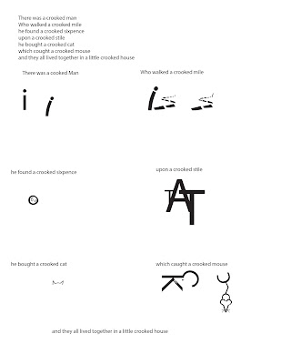
There was a crooked man
and he walked a crooked mile
he found a crooked sixpence
upon a crooked stile
he bought a crooked cat
which caught a crooked mouse
and they all lived together in a little crooked house
t


and he walked a crooked mile
he found a crooked sixpence
upon a crooked stile
he bought a crooked cat
which caught a crooked mouse
and they all lived together in a little crooked house


Reading 6
Reading 6
Clarify Complexity.
Complexity creates interest, but it can also turn viewers off.
Need to be able to explain complex information visually.
Cognition and Complexity
Complex explanations create a large mental load.
Consistency and Context are key.
Applying the principle
Segment complex content into smaller units.
Cutaway views.
Balance necessary detail with simplicity.
Segments and Sequences
Breaking things up makes it easier to understand.
Need to be clear so viewers can understand it.
Specialized Views
Cutaway views.
Realism is useful here.
Interior Views
Explain complex structures and their inner workings.
Show things often invisible.
Exploded Views
Show layers, mechanical systems.
Magnification
High level of detail in large systems.
Highlights detail.
Implied Motion
Motion lines, arrows, and blur.
Inherent Structure
Underlies all information.
Meaning comes from relationships.
Order information by alphabet, time, category and hierarchy


Reading 5
Making the Abstract Concrete
Visuals Help Us Think
Data visualizations concretize abstract ideas and concepts
Abstract Graphics
Enhance credibility of a message.
Each element has a one to one correspondence with what it represents
Space conveys meaning
Symbols are representative
Reduce cognitive load easing understanding
Improve search efficiency, makes it easier to find things
Application
Extend the viewers ability to see think and know
Simplify!
Each element has it's own visual code
Clarity is important, avoid ambiguity
Explanatory/didactic text is super important
Color clarifies
Consider the form of the representation, is it best for your info?
Big Picture View
Diagrams explain structures, processes, transformations, cycles, and functions of a system
Arrows link elements and provide a flow
Viewers derive meaning when the recognize patterns
Data Displays
Graphs are hard to understand, make them easier
Data displays visually communicate relationships from data sets
Help make comparisons, see trends, and find patterns
Bar graphs for comparisons line graphs for trends
Visualize Information
Provide structure for intricate information
Maps
Maps are magical
Use map conventions
Waste Poster

United States of America. Centers for Disease Control and Prevention. National Center for Injury Prevention and Control Division of Unintentional Injury Prevention. Injury Prevention & Control: Prescription Drug Overdose. CDC.gov, 17 Aug. 2015. Web. 25 Aug. 2015.
The CDC does a Biannual report on the causes of death in the US, the statistics I'm using are from the most recent one in 2013.
https://www.drugabuse.gov/related-topics/trends-statistics/overdose-death-rates


I've had a lot of trouble narrowing down ideas but here are two.
One of my ideas is to do an infographic about mass shootings/gun violence.
Aside from this being a hot topic in the news, I have an personal connection which gives me an interesting perspective. My second cousin was killed in the Sandy Hook shootings, and I am a gun owner myself.
There are lots of statistics on this topic. However, I don't know if this falls within the parameters, and would certainly not be a "fun" infographic.
http://www.gannett-cdn.com/GDContent/mass-killings/index.html#frequency
I have also been looking a lot at traffic lights, how inefficient and wasteful they are. In terms of time, environmental impact, and safety. (I have found several sources for statistics on this.) The only problem with this concept is that Ogden in particular is in the process of revamping its traffic signals to make them more efficient.
Reading 3
Direct the Eyes
Intro
Our eyes are attracted to prominent features.
Designers need to be aware of this and make sure the important info is most prominent
Usually viewers start in the upper left corner. Left- to right, Top to bottom movement.
Importance of Attention
Eye movements reflect mental processes.
The focus of our eyes reflect what is being processed in the working memory.
Enhancing Cognitive Processes
Well designed eye paths:
Promote speedy perception
Improves processing
Increases Comprehension
Position
Where things are develop the hierarchy
Three levels: Primary, secondary, and equivalent
Usually, elements at the top are most important
Objects in the tp seem more active, dynamic and potent "heavier"
Movement
The designer can put visual cues in the design to create the illusion of movement in a static picture
Use lines and shapes:
Curved lines/undulating shapes = Smooth movement
Jagged lines create tension and sharp movements and pauses
Left-right movement is easier to perceive.
Perspective
Eye gaze
People's eyes are powerful
We follow their eyes to "see what they are looking at"
Visual Cues
Signals where the viewer's eyes should go
"visual shortcuts"
Increase recall
Arrows give direction and dynamism
Arrows need to have enough weight to capture attention, but not overpower the composition
Color Cues
Color contrast directs the eyes
Helps the viewer see what's important
Limit the number of colors
Subscribe to:
Posts (Atom)